Hi,
Senior UX/UI Designer and Product Designer
My name is Daniel Säflund. I’ve spent 20+ years designing clear, reliable user experiences that support real business goals. I work strategically, but I’m just as committed to the details. I’ve collaborated with both small teams and global brands, and I’m used to working closely with product, tech, brand and design.
I’m comfortable presenting and explaining ideas to stakeholders, and I enjoy turning complex problems into straightforward solutions.
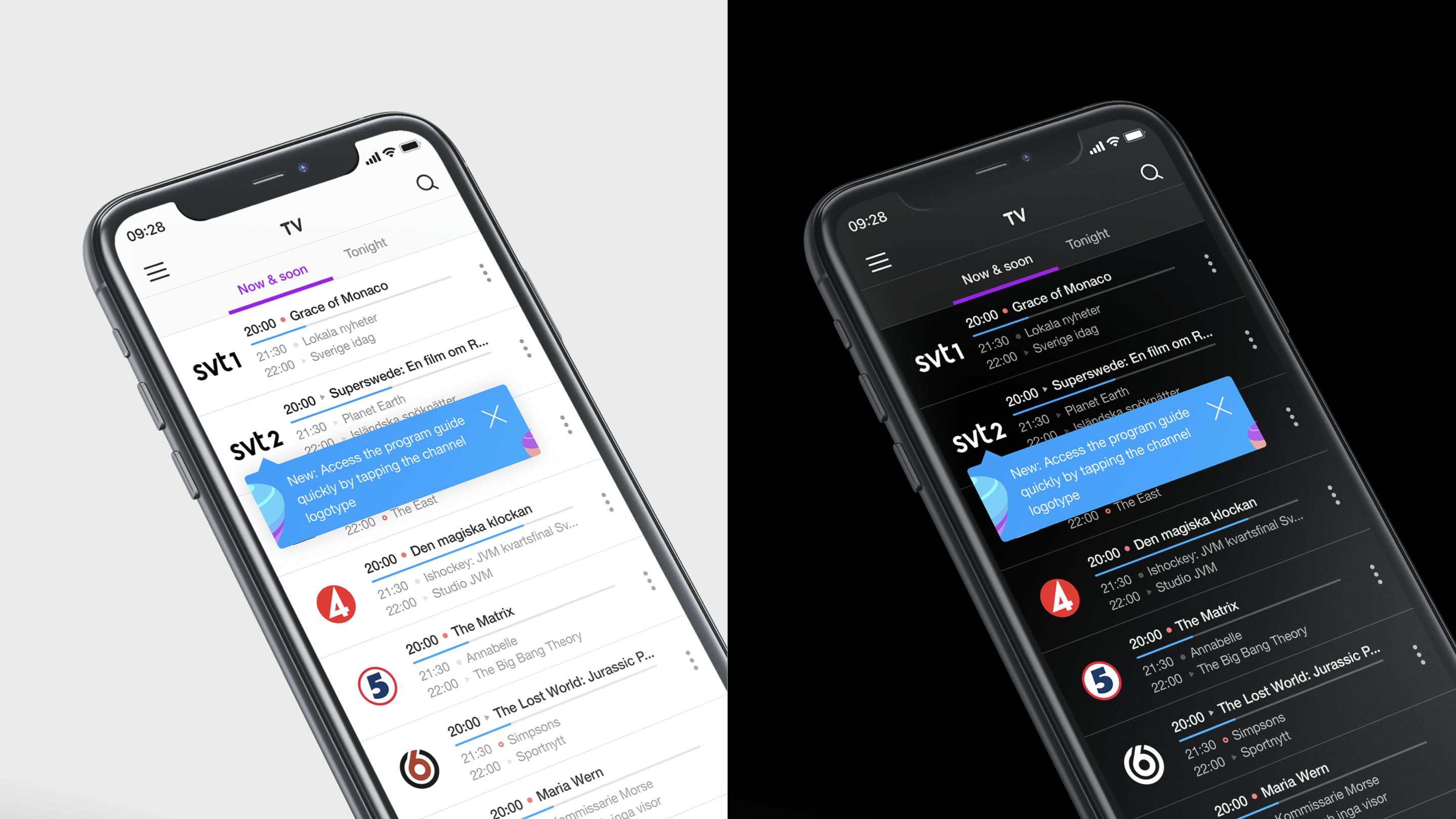
Telia TV / Telia Play
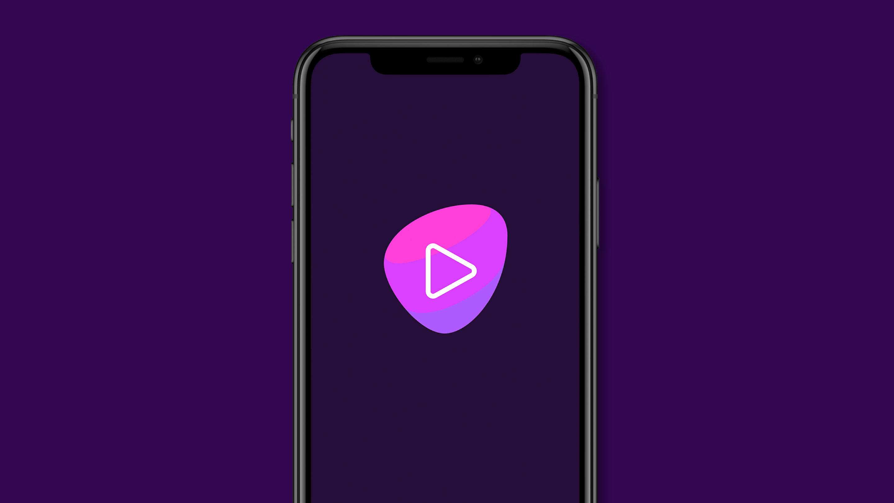
For 7 years, I worked on Telia’s TV and streaming services, designing across iOS, Android, tvOS, smart TVs, digital TV, and web, reaching over 1 million users.
Challenge
Telia’s platforms needed consistent, high-quality experiences at scale across multiple devices, while evolving to meet growing user expectations and maintain market leadership.
Exploration
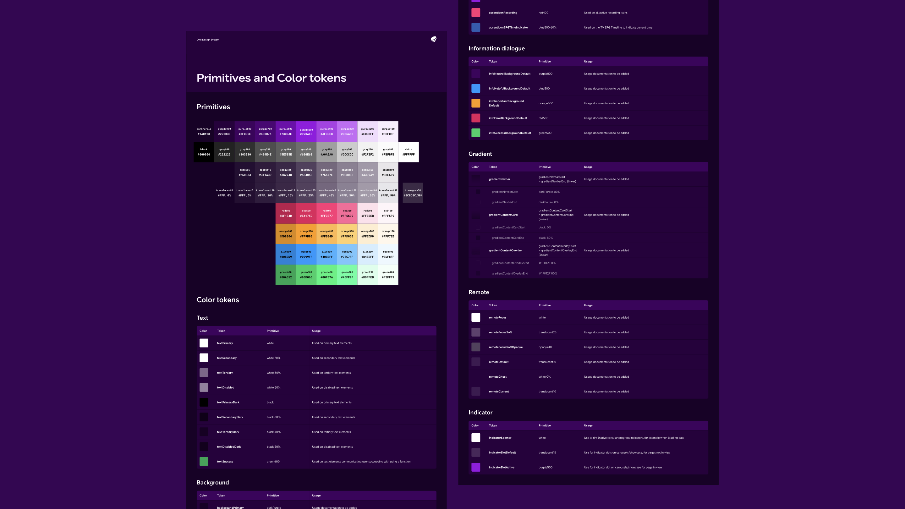
I worked closely with a growing UX team and developers, ensuring that design solutions were technically feasible and user-centered. We leveraged a shared design system with C More to maintain consistency while allowing each brand to retain its identity.
Solution
Through systematic design processes, user research, and cross-functional collaboration, we delivered scalable interfaces and features that enhanced usability and engagement. Telia digital TV won SKI (Swedish Quality Index) for customer satisfaction seven years in a row.

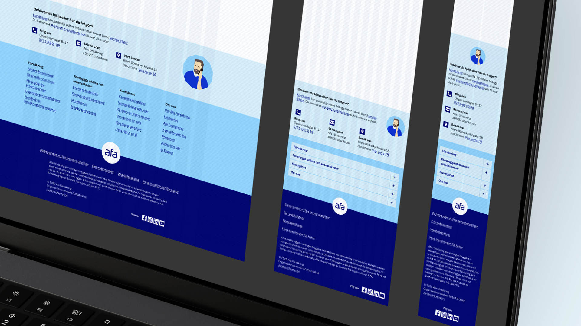
Afa Försäkring
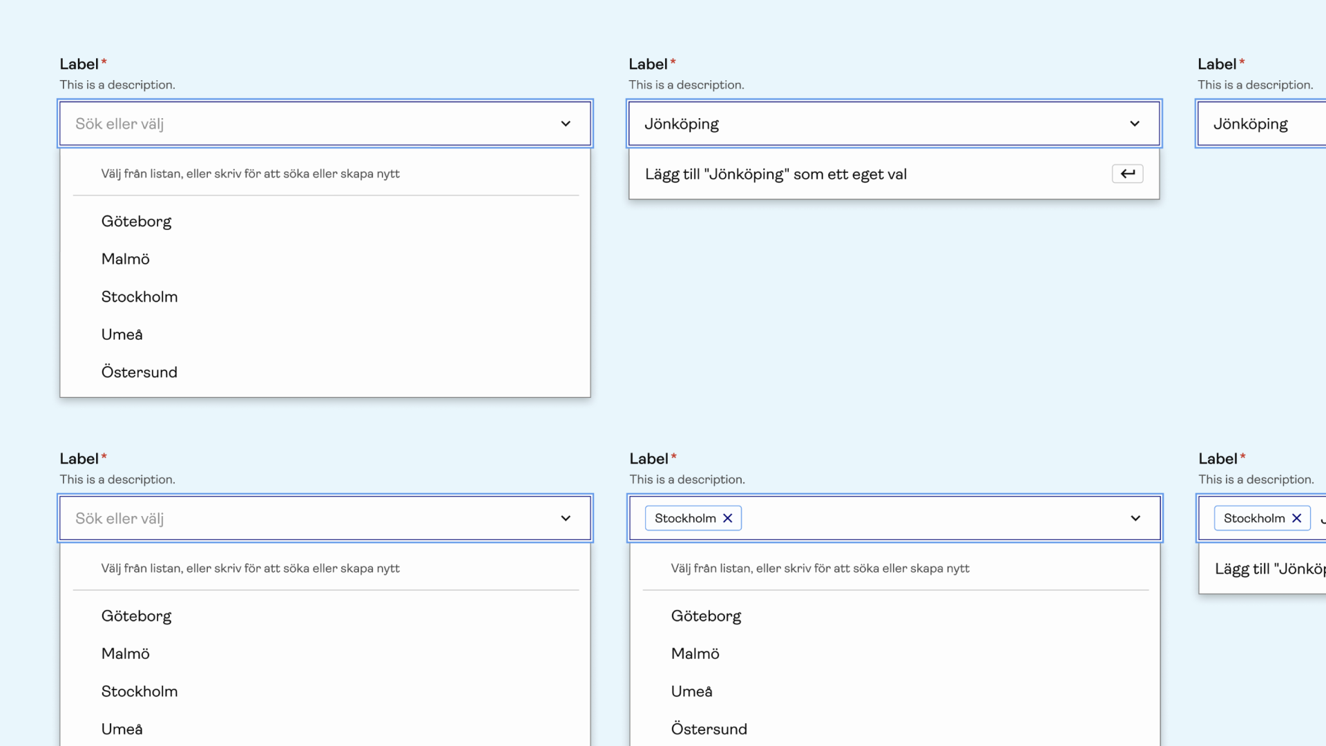
As Design Systems Lead at Afa Försäkring, I ensure that our digital products are accessible and consistent across platforms. I manage the design system and collaborate closely with designers and developers to ensure effective implementation and deliver solutions that meet the needs of both the company and its users.
Challenge
Our digital products needed to be fully accessible for all users, but inconsistencies in the design system and implementation gaps were creating barriers and a fragmented experience.
Exploration
I partnered closely with developers and conducted thorough reviews of existing components to uncover accessibility issues and usability gaps, identifying where the system failed to meet user needs.
Solution
By refining components and updating design guidelines, we created a design system that ensured accessibility, consistency, and scalability, delivering digital products that were both inclusive and aligned with business goals.

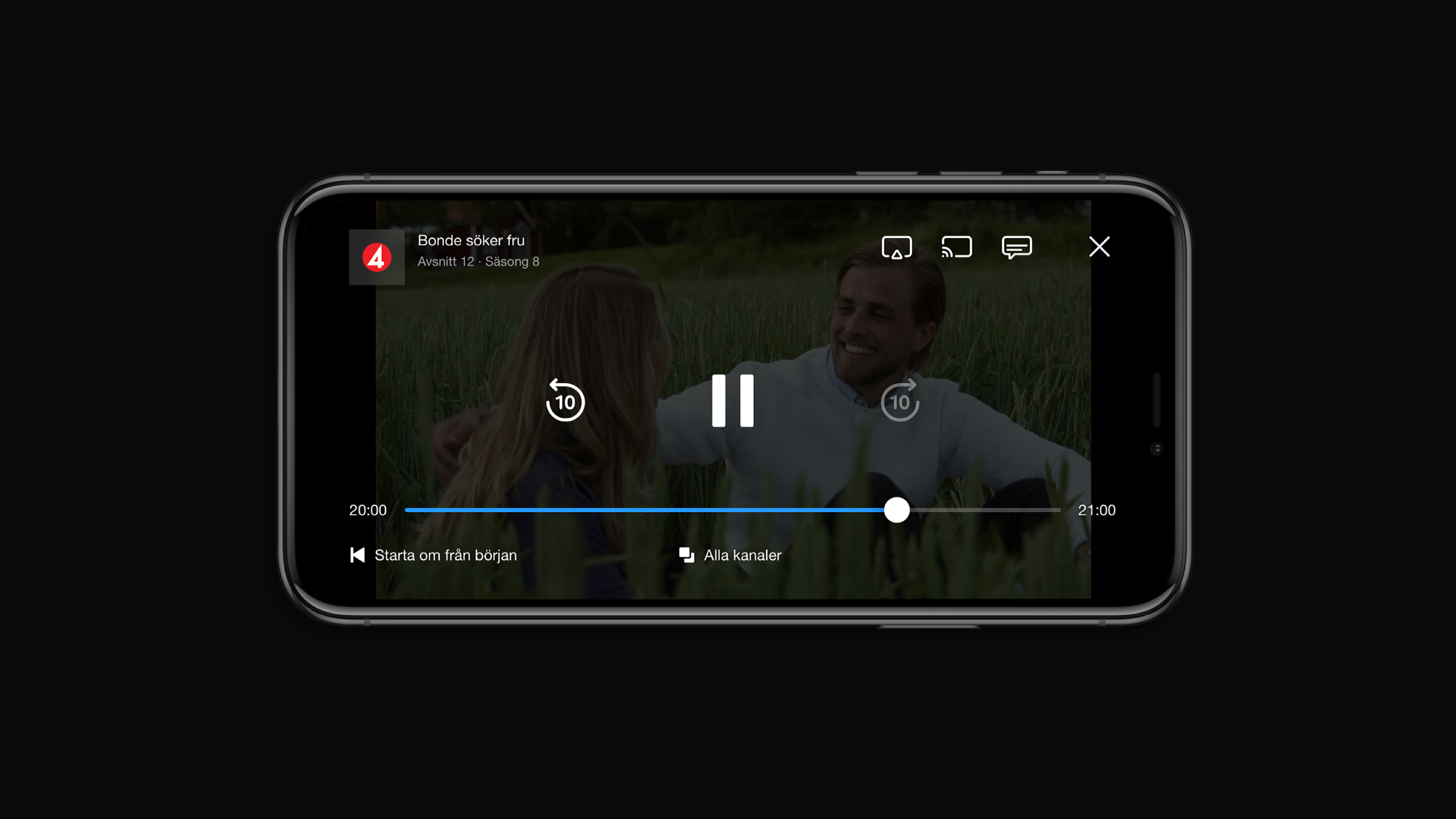
C More / TV4
Parallel to Telia, I led the design for C More’s streaming platforms, which shared the same design system. This allowed us to maintain a coherent visual language while addressing the unique needs of C More’s user base.
Challenge
C More required a distinct brand experience that felt premium and engaging, while integrating technically with Telia’s systems.
Exploration
By working within the shared design system, I coordinated closely with developers and Telia’s UX team to adapt components for C More, ensuring both consistency and flexibility across brands.
Solution
We created a scalable, cohesive interface that reflected C More’s brand identity, delivering a seamless experience across platforms. Users benefited from intuitive navigation and a polished, reliable service, while the team maintained efficiency by leveraging shared components.
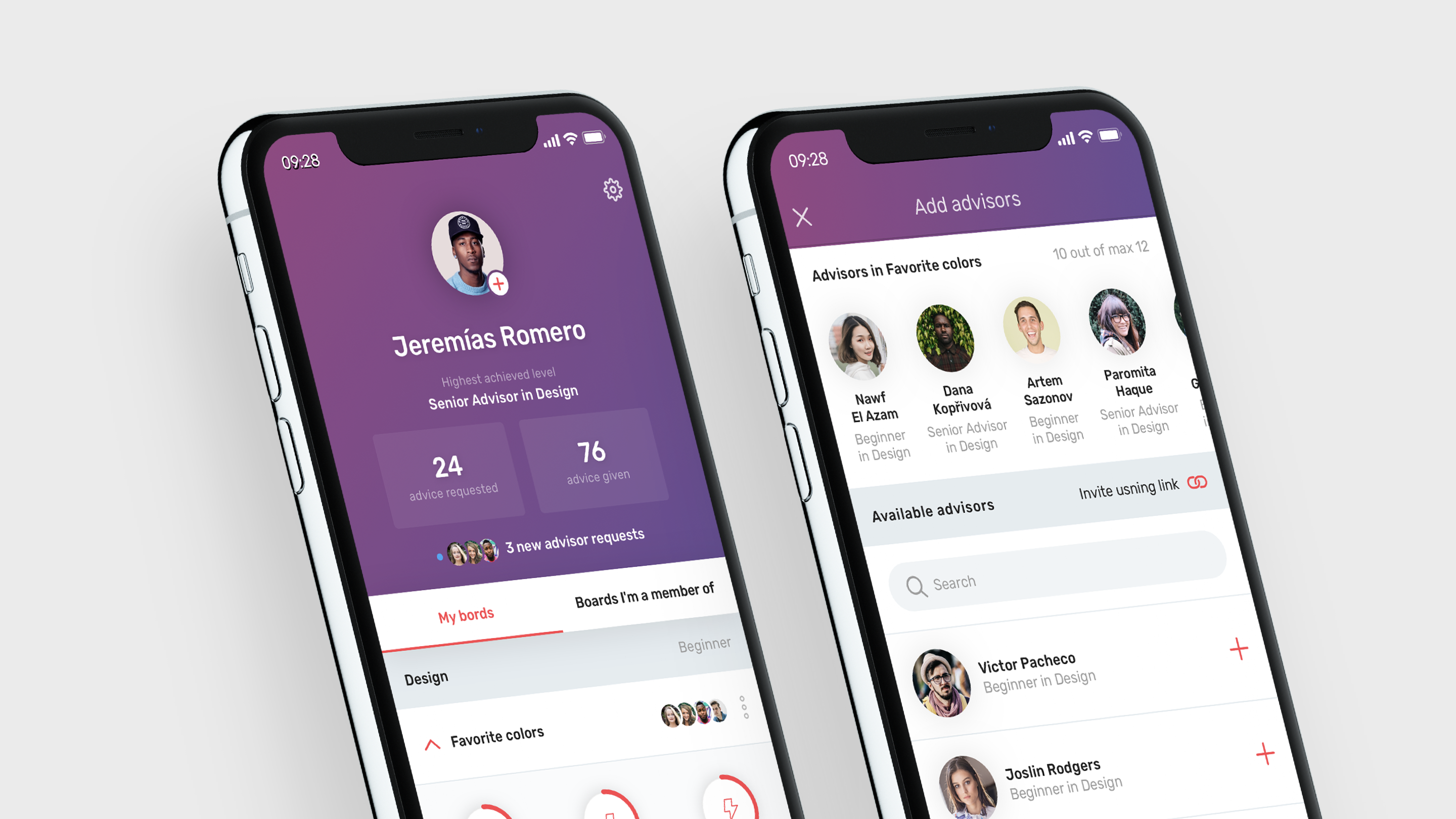
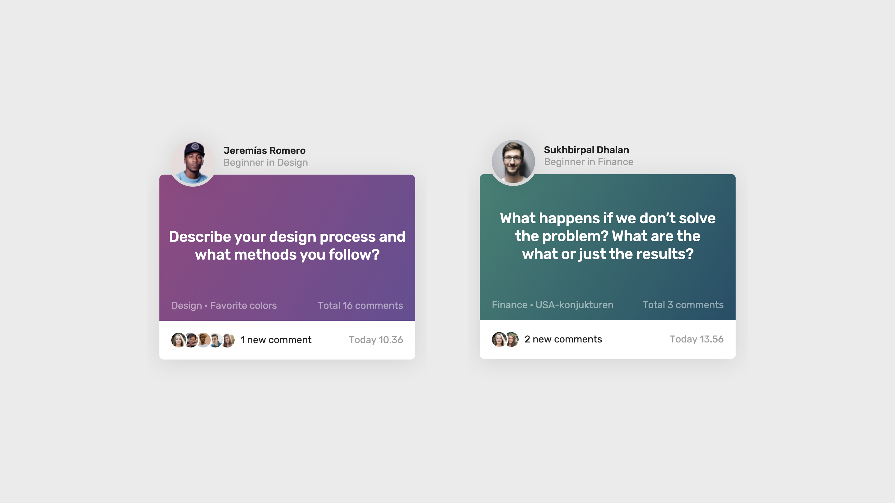
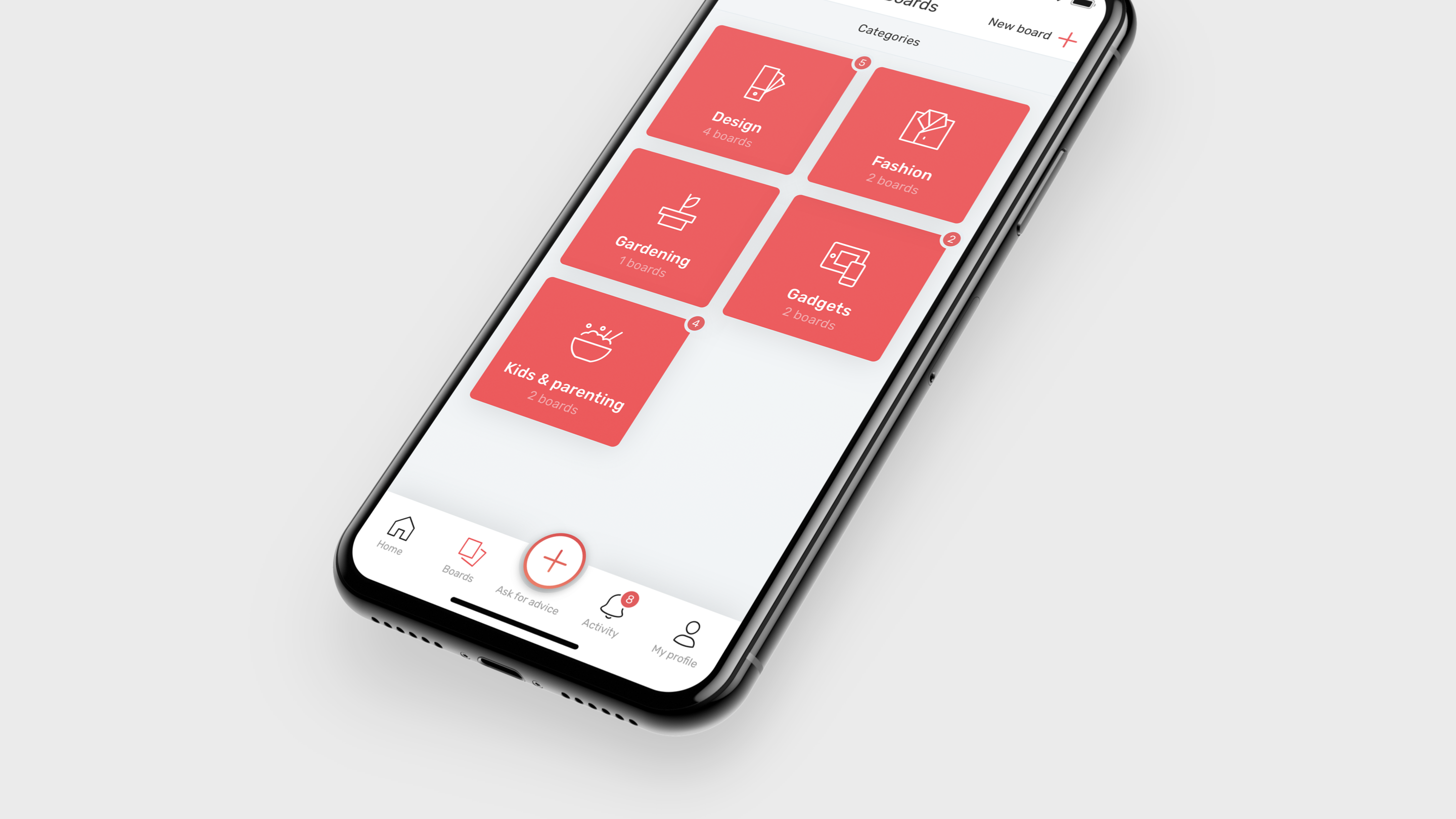
Kebitz
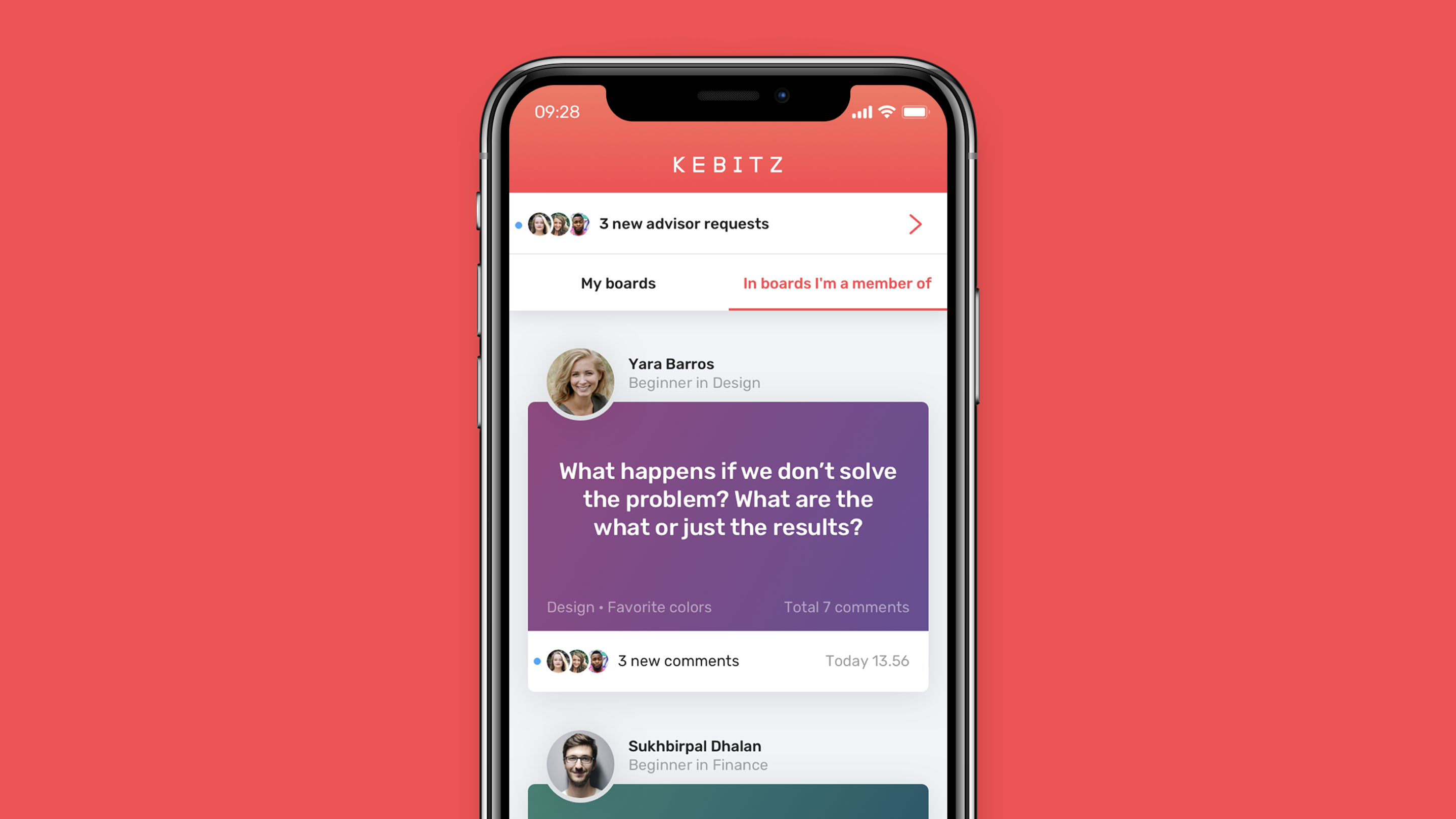
Kebitz is a startup platform built to connect advisors with people seeking guidance. The product needed to support clear, intuitive flows for both parties while maintaining trust and clarity throughout the experience.
Challenge
As an early-stage product, Kebitz needed a structure that could support rapid iteration, early user testing, and efficient development. With limited resources and fast timelines, the goal was to shape a service that felt polished and reliable from day one.
Exploration
I mapped the core user flows for both advisors and recipients, creating prototypes that we used for early user tests to validate assumptions and uncover friction. Throughout the process, I ensured the designs were realistic, efficient to implement, and aligned with the technical roadmap.
Solution
I designed the full interface and created a lightweight but effective design system to accelerate development and keep the experience consistent.

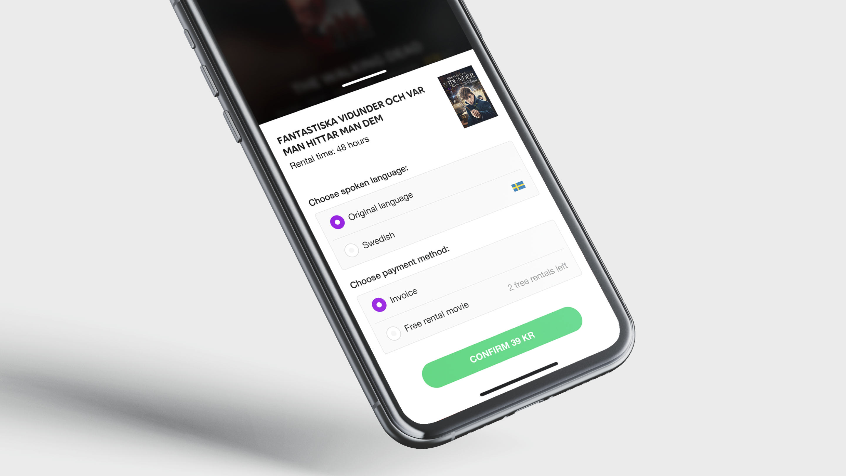
Case studyC More / Telia Content Detail Page
Background:
Challenge
Designing the new Content Detail Page (CDP) for big-screen TV required addressing several critical limitations of the existing experience. The layout was not scalable, it struggled to fit all navigable elements and made it difficult to include related content or future feature modules. Navigation patterns were inconsistent and often unintuitive, creating friction for users relying on a D-pad or remote control.
In addition, the available metadata was limited. Unlike competitors such as Netflix, we had sparse synopses, inconsistent imagery, and fewer editorial assets. The challenge was to redesign the CDP to be both scalable and user-friendly, while presenting content in a clear, compelling, and organized way despite these constraints.
↓
The old and previous Content Detail Page (CDP)
Next step:
Exploration
To elevate the CDP experience despite limited assets, we had to combine technical creativity with careful visual design. While competitors had richer content and more editorial muscle, our goal was to make the experience feel equally premium and immersive.
A key part of this process was structuring the page with multiple layered techniques:
- Backdrop and blur layers for depth and focus.
- Dominant color extraction to dynamically influence UI accents and ensure consistent branding across varied content.
- Smart text truncation logic to automatically shorten descriptions without cutting off key information, maintaining legibility and aesthetics.
We also focused on navigation and usability. Prototypes were tested with a virtual remote control to simulate actual TV interactions, allowing us to refine D-pad flows, button placement, and focus states.
Balancing immersion with usability was challenging: we needed to showcase large hero images while leaving room for metadata, action buttons, and related content, all without awkwardly cropping faces or key visual elements. Iterative testing and layered design logic allowed us to achieve a rich, coherent, and user-friendly experience despite technical and content constraints.
↓
Usability testing protoype with a virtual remote control
Usability testing in Maze
User test report (Maze)
CDP structure for building an immersive experience
Outcome:
Solution
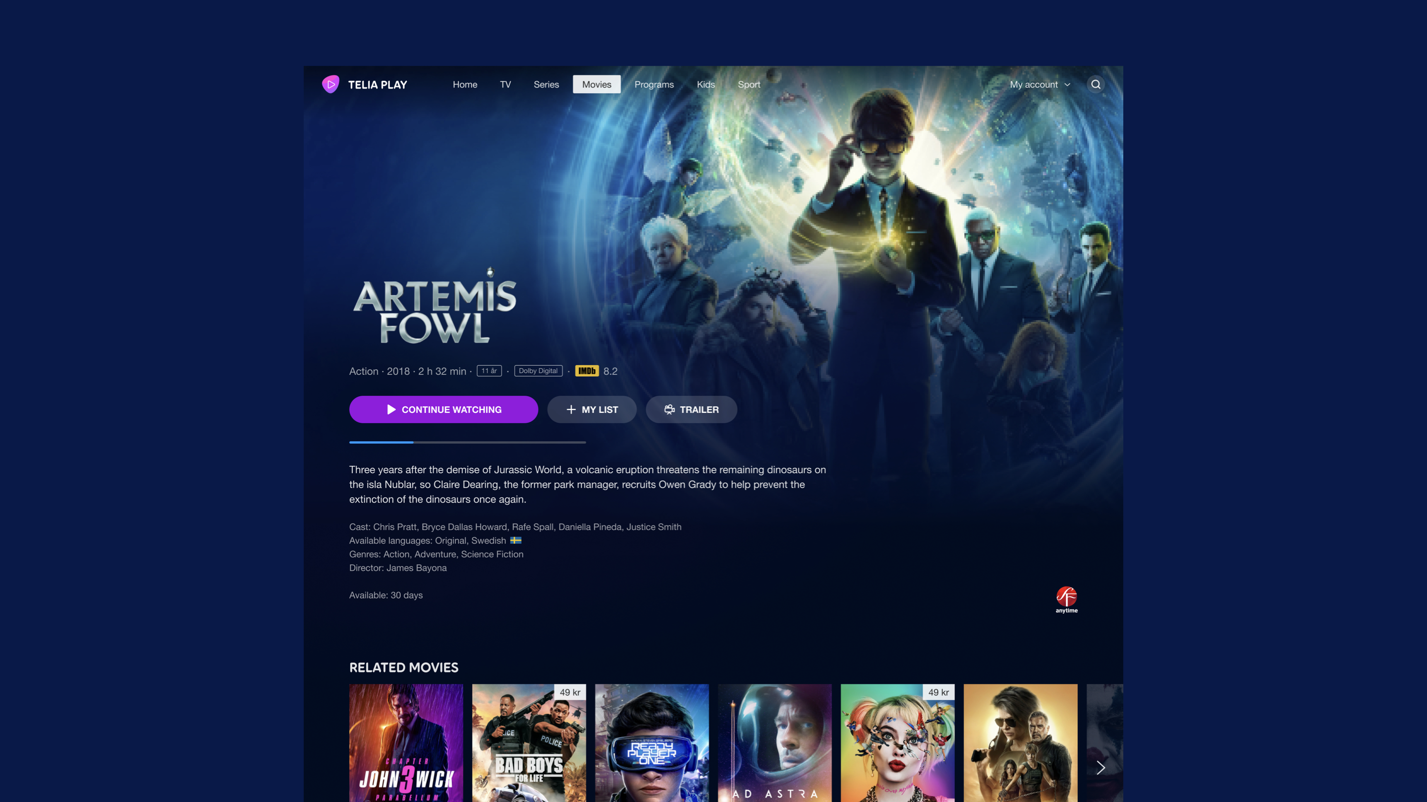
The final CDP design delivers a scalable, immersive, and remote-friendly experience that works across a wide range of TV platforms and content types. The layout now adapts gracefully to different metadata conditions, image qualities, and content formats and provides a clear structure for future features.
The new visual system builds on the layered architecture explored during the design phase. By combining dominant color extraction, backdrop images, blur-masks, and adaptive overlays, the page achieves a cinematic feel without relying on high-quality editorial assets. This allowed us to elevate lower-fidelity content and maintain a consistently premium look across the catalogue.
Primary actions (Play, Continue, Add to List) are positioned for immediate access, and the D-pad navigation follows predictable vertical and horizontal paths. Focus states are strong and readable from a distance, reducing cognitive load for users who navigate from several meters away.
Adaptive content modules:
- Clean metadata blocks with smart text shortening (no mid-word truncation).
- Flexible synopsis handling through progressive disclosure.
- Optional related-content rails that can appear without breaking the layout.
Designed for real-world constraints: solutions were built around the realities of the platform, imperfect images, inconsistent text quality, and varying device performance. The design system ensures fallback behaviors for every scenario, from missing art to long titles, helping the CDP feel polished and reliable even under less-than-ideal conditions.
The redesigned CDP strengthened the perceived quality of the service and created a consistent, scalable foundation for future TV experiences. Navigation became more predictable, browsing more immersive, and the overall interaction smoother. Internally, the new structure also aligned designers, developers, and editorial teams around a more robust and future-proof model.
↓
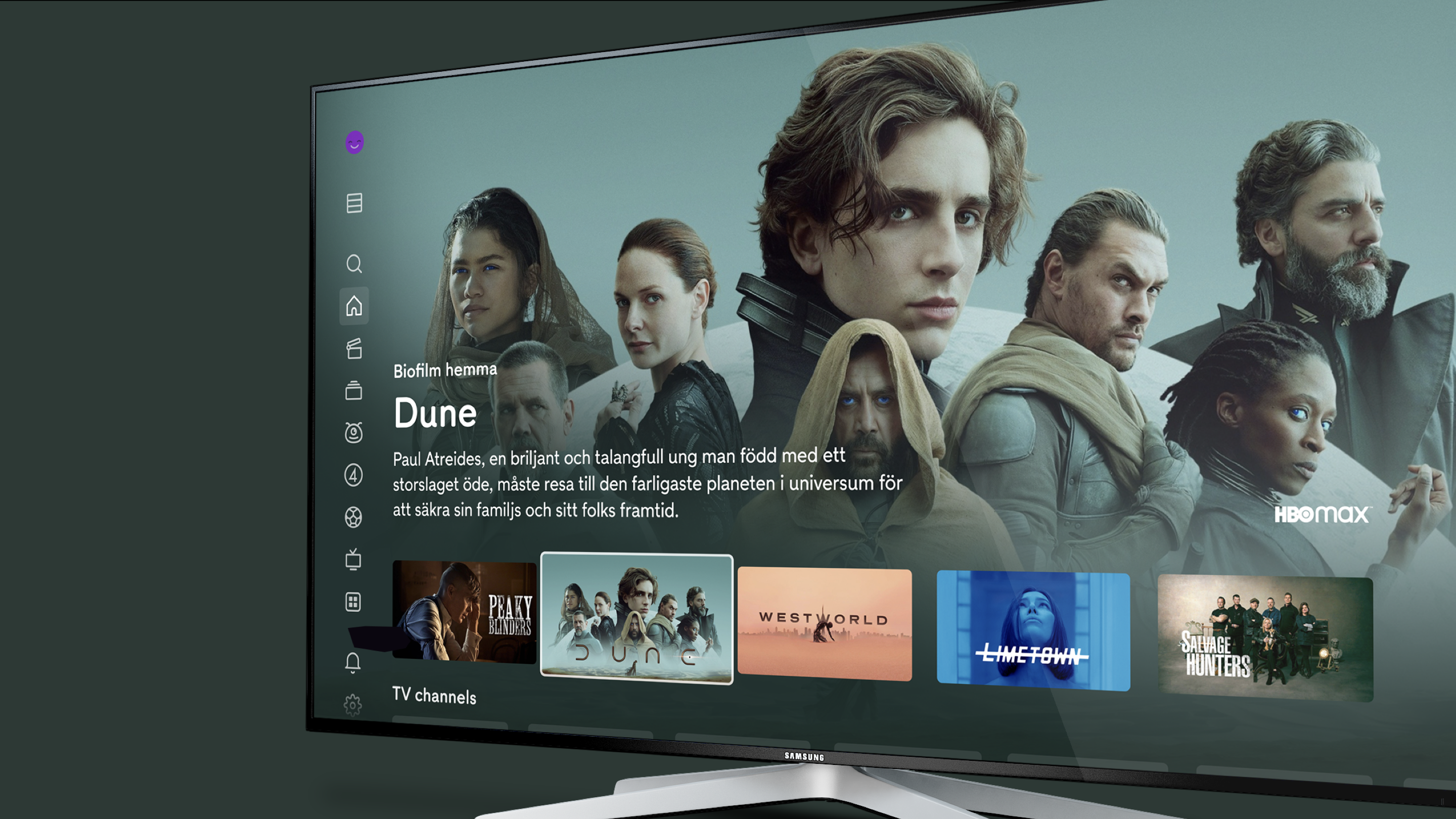
The new movie CDP
The new TV series CDP
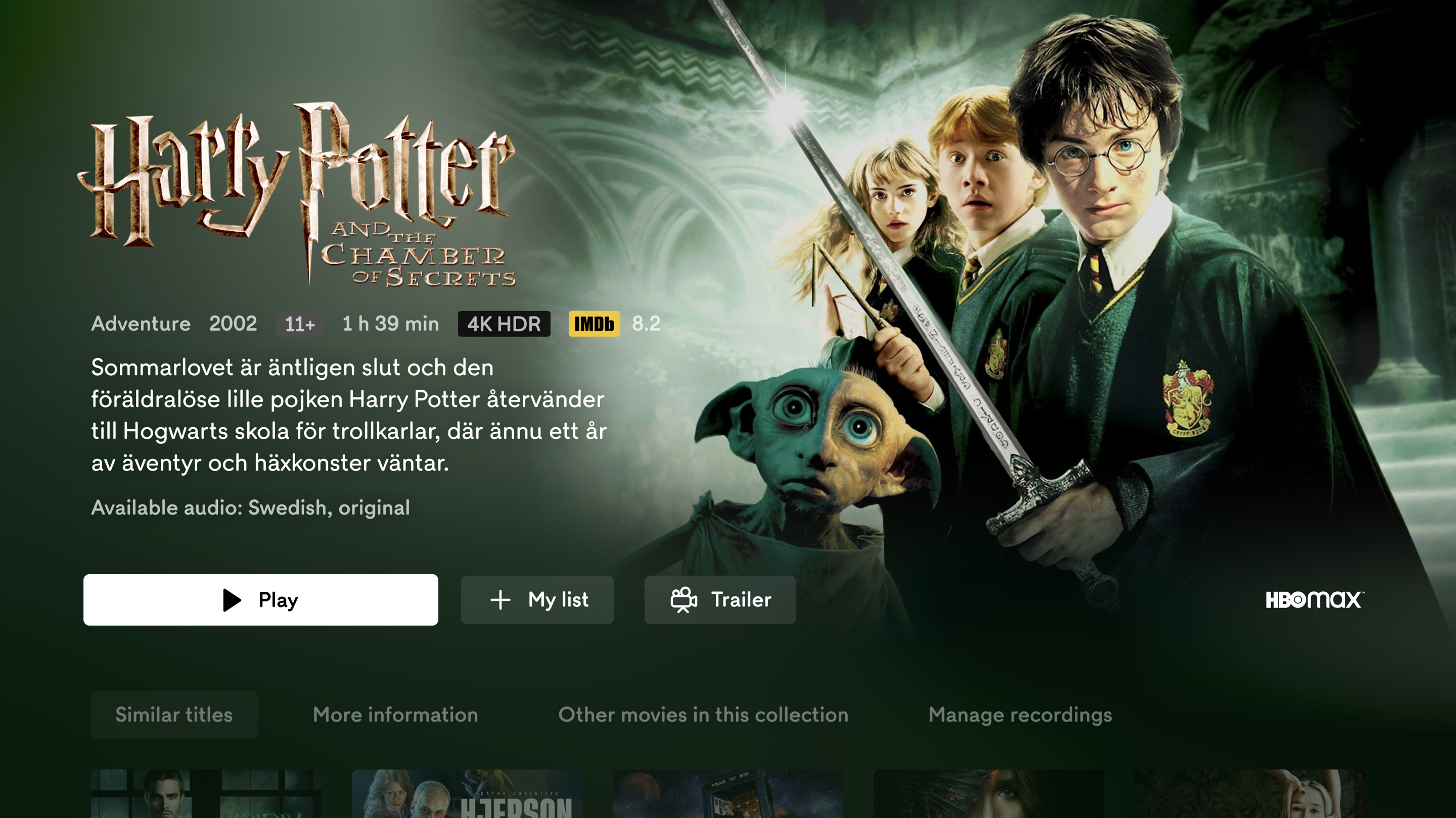
Another example of the new movie CDP
Nordisk Renting
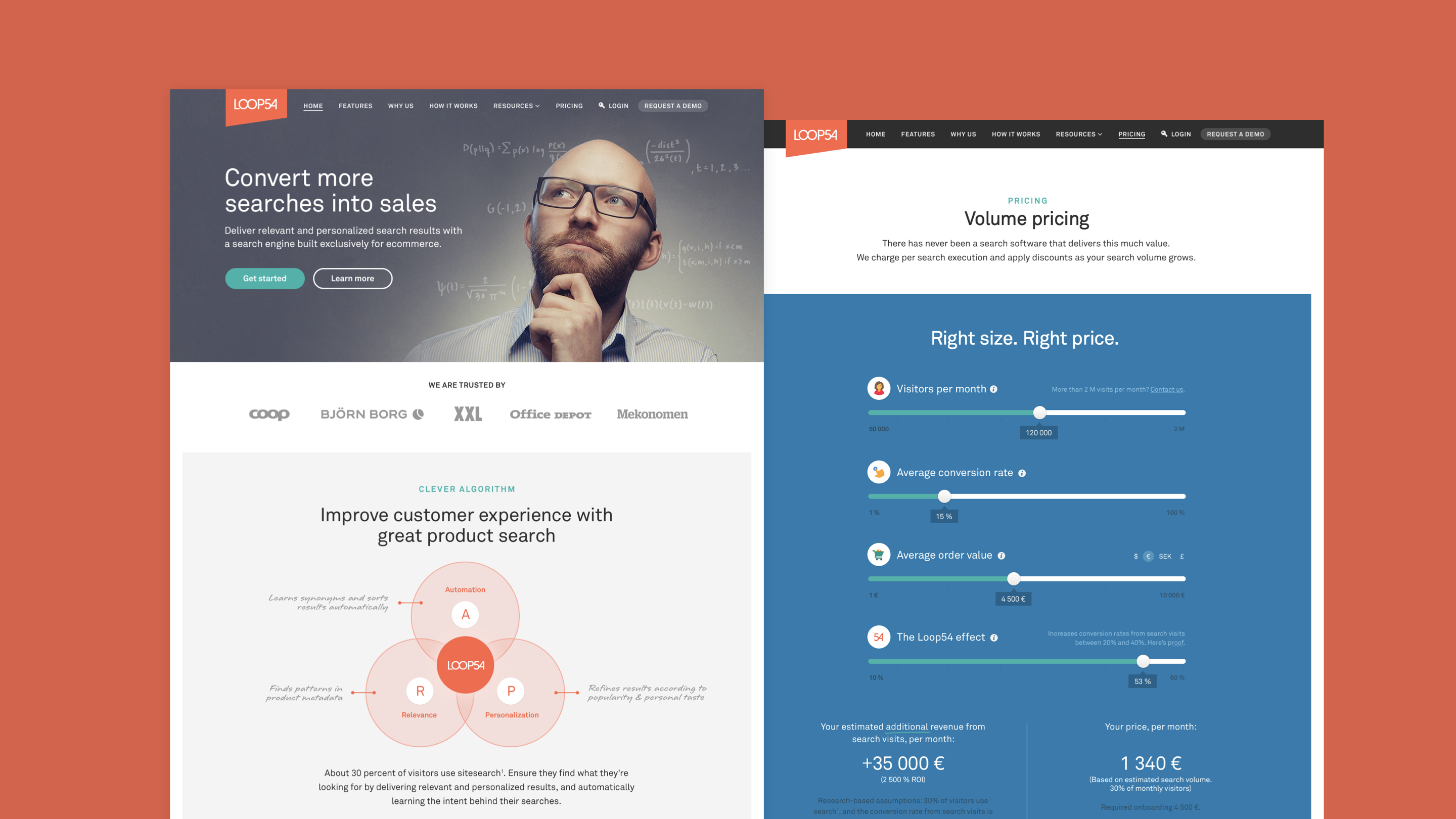
Loop 54
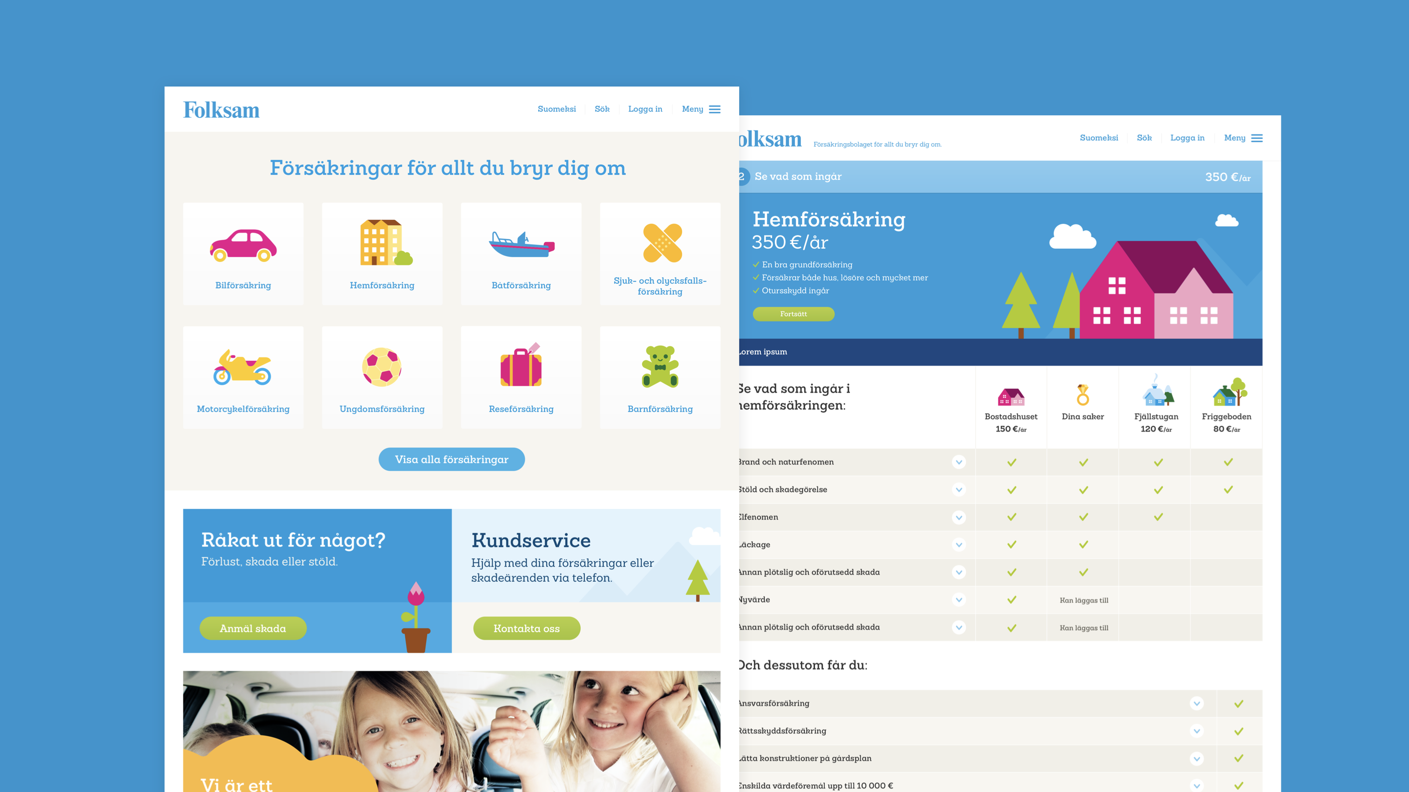
Folksam
Hi,
Senior UX/UI Designer and Product Designer
My name is Daniel Säflund. I’ve spent 20+ years designing clear, reliable user experiences that support real business goals. I work strategically, but I’m just as committed to the details. I’ve collaborated with both small teams and global brands, and I’m used to working closely with product, tech, brand and design.
I’m comfortable presenting and explaining ideas to stakeholders, and I enjoy turning complex problems into straightforward solutions.
Telia TV / Telia Play
For 7 years, I worked on Telia’s TV and streaming services, designing across iOS, Android, tvOS, smart TVs, digital TV, and web, reaching over 1 million users.
Challenge
Telia’s platforms needed consistent, high-quality experiences at scale across multiple devices, while evolving to meet growing user expectations and maintain market leadership.
Exploration
I worked closely with a growing UX team and developers, ensuring that design solutions were technically feasible and user-centered. We leveraged a shared design system with C More to maintain consistency while allowing each brand to retain its identity.
Solution
Through systematic design processes, user research, and cross-functional collaboration, we delivered scalable interfaces and features that enhanced usability and engagement. Telia digital TV won SKI (Swedish Quality Index) for customer satisfaction seven years in a row.
Afa Försäkring
As Design Systems Lead at Afa Försäkring, I ensure that our digital products are accessible and consistent across platforms. I manage the design system and collaborate closely with designers and developers to ensure effective implementation and deliver solutions that meet the needs of both the company and its users.
Challenge
Our digital products needed to be fully accessible for all users, but inconsistencies in the design system and implementation gaps were creating barriers and a fragmented experience.
Exploration
I partnered closely with developers and conducted thorough reviews of existing components to uncover accessibility issues and usability gaps, identifying where the system failed to meet user needs.
Solution
By refining components and updating design guidelines, we created a design system that ensured accessibility, consistency, and scalability, delivering digital products that were both inclusive and aligned with business goals.
C More / TV4
Parallel to Telia, I led the design for C More’s streaming platforms, which shared the same design system. This allowed us to maintain a coherent visual language while addressing the unique needs of C More’s user base.
Challenge
C More required a distinct brand experience that felt premium and engaging, while integrating technically with Telia’s systems.
Exploration
By working within the shared design system, I coordinated closely with developers and Telia’s UX team to adapt components for C More, ensuring both consistency and flexibility across brands.
Solution
We created a scalable, cohesive interface that reflected C More’s brand identity, delivering a seamless experience across platforms. Users benefited from intuitive navigation and a polished, reliable service, while the team maintained efficiency by leveraging shared components.
Kebitz
Kebitz is a startup platform built to connect advisors with people seeking guidance. The product needed to support clear, intuitive flows for both parties while maintaining trust and clarity throughout the experience.
Challenge
As an early-stage product, Kebitz needed a structure that could support rapid iteration, early user testing, and efficient development. With limited resources and fast timelines, the goal was to shape a service that felt polished and reliable from day one.
Exploration
I mapped the core user flows for both advisors and recipients, creating prototypes that we used for early user tests to validate assumptions and uncover friction. Throughout the process, I ensured the designs were realistic, efficient to implement, and aligned with the technical roadmap.
Solution
I designed the full interface and created a lightweight but effective design system to accelerate development and keep the experience consistent.
Case studyC More / Telia Content Detail Page
Background:
Challenge
Designing the new Content Detail Page (CDP) for big-screen TV required addressing several critical limitations of the existing experience. The layout was not scalable, it struggled to fit all navigable elements and made it difficult to include related content or future feature modules. Navigation patterns were inconsistent and often unintuitive, creating friction for users relying on a D-pad or remote control.
In addition, the available metadata was limited. Unlike competitors such as Netflix, we had sparse synopses, inconsistent imagery, and fewer editorial assets. The challenge was to redesign the CDP to be both scalable and user-friendly, while presenting content in a clear, compelling, and organized way despite these constraints.
↓
The old and previous Content Detail Page (CDP)
Next step:
Exploration
To elevate the CDP experience despite limited assets, we had to combine technical creativity with careful visual design. While competitors had richer content and more editorial muscle, our goal was to make the experience feel equally premium and immersive.
A key part of this process was structuring the page with multiple layered techniques:
- Backdrop and blur layers for depth and focus.
- Dominant color extraction to dynamically influence UI accents and ensure consistent branding across varied content.
- Smart text truncation logic to automatically shorten descriptions without cutting off key information, maintaining legibility and aesthetics.
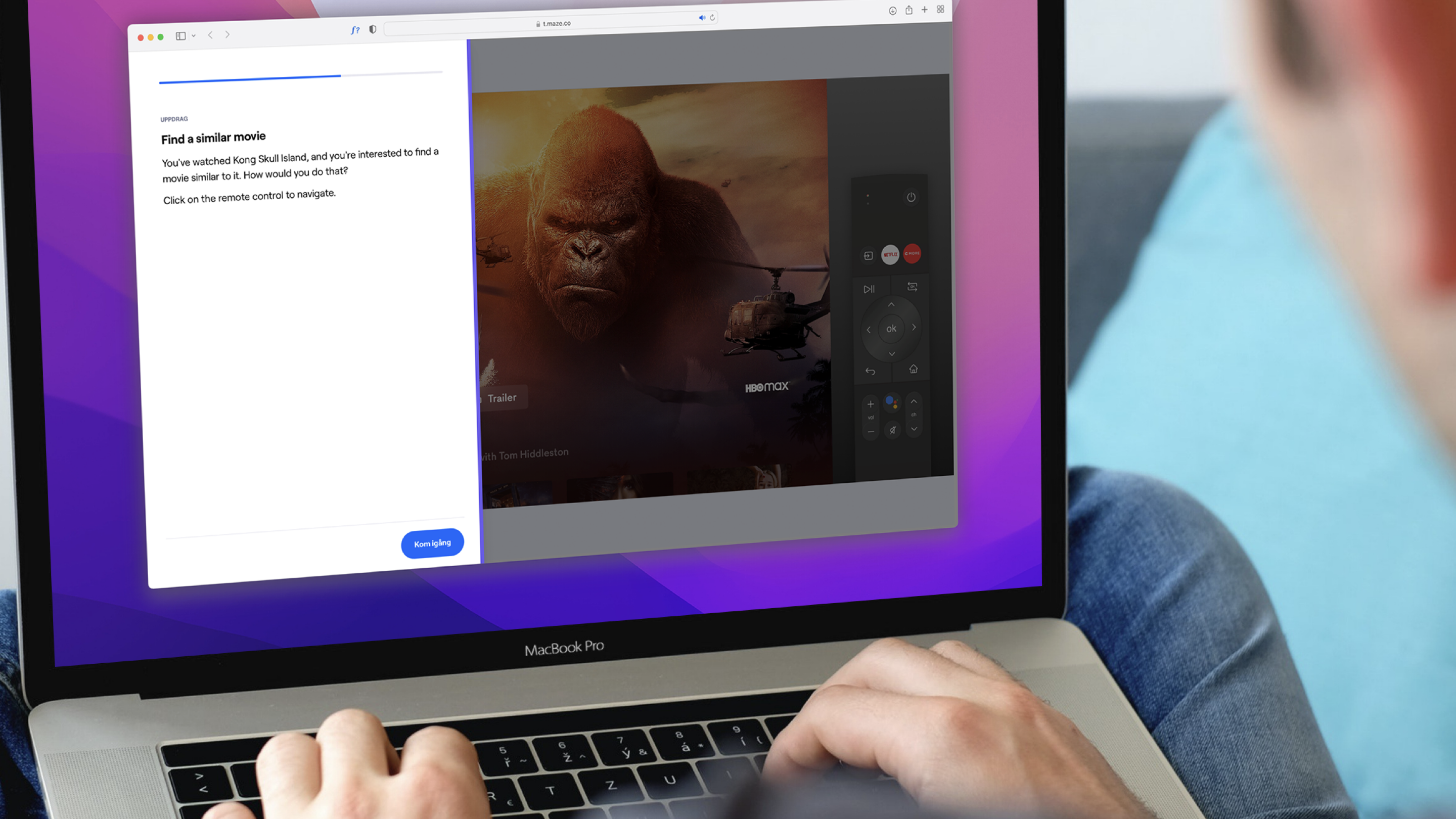
We also focused on navigation and usability. Prototypes were tested with a virtual remote control to simulate actual TV interactions, allowing us to refine D-pad flows, button placement, and focus states.
Balancing immersion with usability was challenging: we needed to showcase large hero images while leaving room for metadata, action buttons, and related content, all without awkwardly cropping faces or key visual elements. Iterative testing and layered design logic allowed us to achieve a rich, coherent, and user-friendly experience despite technical and content constraints.
↓
Usability testing protoype with a virtual remote control
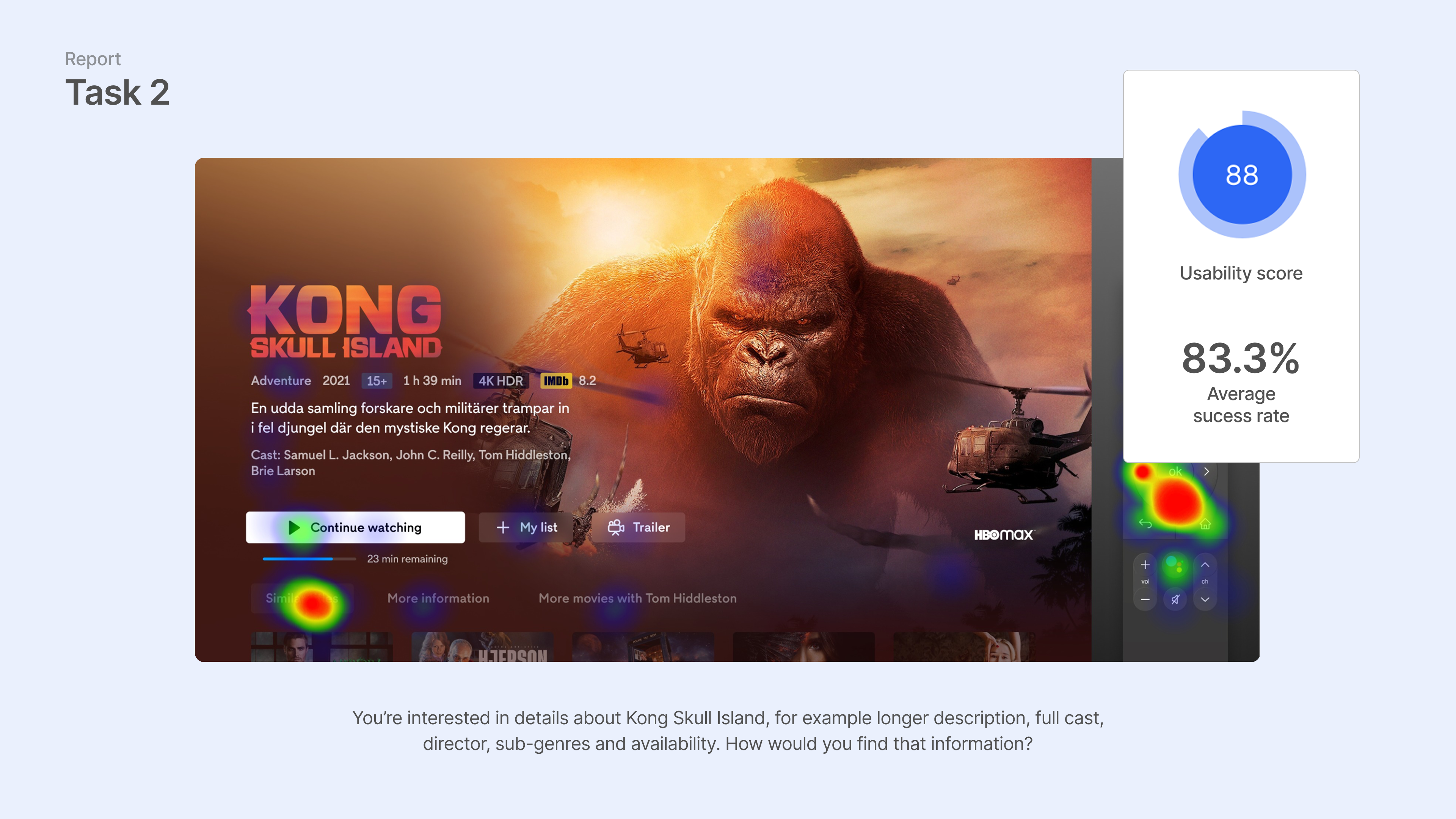
Usability testing in Maze
User test report (Maze)
CDP structure for building an immersive experience
Outcome:
Solution
The final CDP design delivers a scalable, immersive, and remote-friendly experience that works across a wide range of TV platforms and content types. The layout now adapts gracefully to different metadata conditions, image qualities, and content formats and provides a clear structure for future features.
The new visual system builds on the layered architecture explored during the design phase. By combining dominant color extraction, backdrop images, blur-masks, and adaptive overlays, the page achieves a cinematic feel without relying on high-quality editorial assets. This allowed us to elevate lower-fidelity content and maintain a consistently premium look across the catalogue.
Primary actions (Play, Continue, Add to List) are positioned for immediate access, and the D-pad navigation follows predictable vertical and horizontal paths. Focus states are strong and readable from a distance, reducing cognitive load for users who navigate from several meters away.
Adaptive content modules:
- Clean metadata blocks with smart text shortening (no mid-word truncation).
- Flexible synopsis handling through progressive disclosure.
- Optional related-content rails that can appear without breaking the layout.
Designed for real-world constraints: solutions were built around the realities of the platform, imperfect images, inconsistent text quality, and varying device performance. The design system ensures fallback behaviors for every scenario, from missing art to long titles, helping the CDP feel polished and reliable even under less-than-ideal conditions.
The redesigned CDP strengthened the perceived quality of the service and created a consistent, scalable foundation for future TV experiences. Navigation became more predictable, browsing more immersive, and the overall interaction smoother. Internally, the new structure also aligned designers, developers, and editorial teams around a more robust and future-proof model.
↓